
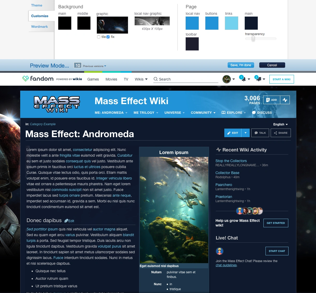
Today we are excited to announce the official release date for the redesigned page and article headers. One of the things we talk about in the announcement is the updates we have made to the Theme Designer so you can customize the header image and the color of the header. You can see a mockup of the Theme Designer change here:
As part of the redesign we also announced that we will no longer be allowing most forms of CSS and JS customization to the headers. This includes adding fourth and fifth level sub-menus to Wiki Navigation. Some wikis out there have these customizations, and a point of feedback we heard when we showed these changes to the Community Council was that some admins felt that these fourth and fifth levels were essential to their navigational structure. We've opted to disallow this type of customization not only to ensure design consistency across Fandom but also because of the simple fact that it's a bad design practice and hinders the user experience.
The thinking admins tend to have in adding in fourth and fifth level options is that more navigational links leads to more visitor engagement. After all, if visitors can see as many major topics as possible in the navigation menus, they're more likely to find what they're looking for and stick around, right? That's not actually the case. Providing more links actually makes things more difficult for your visitors.
Too much choice is a bad thing in the user experience design world because it leads to what's known as decision paralysis. This means there's so much over-analysis of what to do that visitors find it difficult to decide what to navigate to. Once a user reaches this point, they get frustrated and leave with a bad taste in their mouth, making them unlikely to return to your wiki and instead find answers elsewhere.
So what makes a great menu navigation? How should you handle your complex wiki structure with thousands of pages? And why should you limit your navigational links? Here are a few articles answering these very questions, which we think are helpful to understanding the reasons why we do not want fourth and fifth level options:
- http://www.uxbooth.com/articles/the-rules-for-modern-navigation/
- https://www.interaction-design.org/literature/article/hick-s-law-making-the-choice-easier-for-users
- http://uxmyths.com/post/712569752/myth-more-choices-and-features-result-in-higher-satisfac
- https://www.ted.com/talks/barry_schwartz_on_the_paradox_of_choice
Here are the key points you can find in the articles, which you should keep in mind when designing a navigational structure:
- Follow the KISS method to success: "Keep It Simple and Straightforward."
- Avoid deep navigation, like level 4s and 5s, for the reasons addressed in this post.
- Group menu items into high-level categories. Users don't need to see every major topic, they just need to have a way to access them. Prioritize your navigation to the pages users need the most, not everything you think they might be looking for.
- Separate essential links from secondary "nice to have" links, then build your navigation accordingly.
- While simplifying your navigation think about ways you can add important and/or related links to your content, rather than the navigation menus.
I hope this advice is helpful for those wikis with fourth and fifth level menus. We are more than happy to work with with any community with fourth and fifth levels on advice and other good practices when they are adjusting their navigation structure to account for this change.


