Tag: rte-source |
Tag: sourceedit |
||
| Line 81: | Line 81: | ||
===Custom theming=== |
===Custom theming=== |
||
| − | Default infobox wikia color theme can be overwritten using either '''theme''' or '''theme-source''' attributes of '''infobox''' tag. The '''theme''' attribute is used for |
+ | Default infobox wikia color theme can be overwritten using either '''theme''' or '''theme-source''' attributes of '''infobox''' tag. The '''theme''' attribute is used for specifying default custom theme on the template level. The '''theme-source''' attribute holds variable name used to pass the custom theme name from template invocation inside the article. If both attributes are used inside the infobox tag the theme attribute is treated as default one. |
<pre> |
<pre> |
||
<infobox theme="my-default-custom-theme" theme-source="my-custom-theme"> |
<infobox theme="my-default-custom-theme" theme-source="my-custom-theme"> |
||
Revision as of 23:53, 7 July 2015

A sample infobox
- This feature or extension is currently under development - it may be in beta testing on specific communities, but may not be widely available for some time.
Infoboxes are like fact sheets, or sidebars in magazine articles, designed to present a summary of the topic of the page. They present important points in an organized and quickly readable format. The sections of an infobox are usually the same from article to article to create consistency across the wikia. Infoboxes are made with templates.
How to use
You can add an infobox through source mode on an article by copying the syntax on the template's documentation page (found at the bottom of the infobox template's page) and pasting it at the top of an article, changing the words after the equals signs to provide the information needed. For example:
{{infobox character
 | title         = Flowa
 | image         = Example.jpg
 | imagecaption  = Flowa, at rest
 | position      = Legal Secretary
 | age           = 2 months
 | status        = Active
 | height        = 5 inches
 | weight        = 20 grams
}}
Creating new infoboxes
First, create new template, with any name you like, for example Template:ExampleInfobox. Lets start with infobox base, which is title and image.
<infobox>
 <title source="name"><default>{{PAGENAME}}</default></title>
 <image source="image" />
</infobox>
This wikitext will tell your template to use name and image variables for title and image elements. Additionally you can provide default tag, which value will be used instead when variable is not provided or empty.
Right now we only need fields containing additional information, lets add one.
<data source="season"><label>Season(s)</label></data>
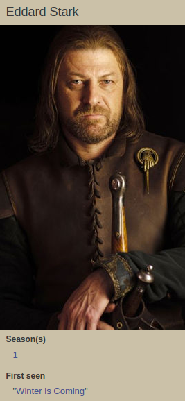
After adding one last field with source set to first and label to First seen we can invoke template in an article with data to get a working infobox.
{{ExampleInfobox
|name=Eddard Stark
|image=eddard.jpg
|season=[Season 1|1]
|first=[Winter is Coming]
}}
And your template ends up like this:
<infobox>
 <title source="name"><default>{{PAGENAME}}</default></title>
 <image source="image" />
 <data source="season"><label>Season(s)</label></data>
 <data source="first"><label>First seen</label></data>
</infobox>
Styling and Display
The infobox is already styled. It is using your wikia's theme. If you change colors in Theme Designer, the infobox will automatically adjust. If any of the variables is empty, it won't be displayed (unless the default tag is invoked).
Layout options
The are two alternative layout options available for infobox:
- default layout ( tag labels displayed above the value)
                    <infobox>
                       //...
                    </infobox>
- tabular layout ( tag labels displayed on the left side of the value)
                    <infobox layout="tabular">
                       //...
                    </infobox>
")
")
Custom theming
Default infobox wikia color theme can be overwritten using either theme or theme-source attributes of infobox tag. The theme attribute is used for specifying default custom theme on the template level. The theme-source attribute holds variable name used to pass the custom theme name from template invocation inside the article. If both attributes are used inside the infobox tag the theme attribute is treated as default one.
    <infobox theme="my-default-custom-theme" theme-source="my-custom-theme">
      //...
    </infobox>
The name of the custom theme is CSS class name added to the HTML wrapper for the infobox markup and can by styled in custom.css file.
    .portable-infobox-theme-my-custom-theme {
        //custom theme styles
    }
Advanced usage
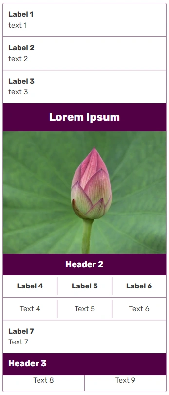
Now, that you have created a simple infobox, you can learn how to use more advanced fields. In this section we are going to build infobox shown on the left.
Building advanced infoboxes
Multiple ordering options for simple tags
There are three normal key-value fields, then title and image fields. As you can see, the title field is not bound to be a first field, but you can only use the Title field once per infobox.
<infobox>
 <data source="prev"><label>Previous</label></data>
 <data source="conc"><label>Concurrent</label></data>
 <data source="next"><label>Next</label></data>
 <title source="name" />
 <image source="image" />
</infobox>
Grouping information inside the group tags
Next field will let you put a number of fields into group, each of which can be named with header. Remember: fields that are declared but don't have a value won't appear. This rule also applies to group - if none of the fields (excluding header tag) inside any particular group have a value, the whole thing won't show up.
<infobox>
 <data source="prev"><label>Previous</label></data>
 <data source="conc"><label>Concurrent</label></data>
 <data source="next"><label>Next</label></data>
 <title source="name" />
 <image source="image" />
 <group>
  <header>Details</header>
  <data source="conflict"><label>Conflict</label></data>
  <data source="date"><label>Date</label></data>
  <data source="place"><label>Place</label></data>
  <data source="result"><label>Outcome</label></data>
 </group>
</infobox>
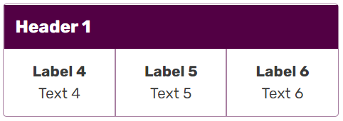
Alternative layout for group tags
Group tag can have alternative horizontal layout where all its content is displayed next to each other in single horizontal line. This can be achievied by adding layout='horizontal" attribute to the group tag.
            <group layout="horizontal">
               // ...
            </group>

Horizontal Group
Comparing values with comparison tag
And now the hardest of all, comparison tag. It gives you an easy way to compare two forces, especially useful in battle or war infoboxes.
Comparison contains set tags, each of which defines compared values. In header tag you can put name of the compared value. For inside use other fields introduced before, for example data tag.
 <comparison>
  <set>
   <header>Combatants</header>
   <data source="side1" />
   <data source="side2" />
  </set>
 </comparison>
Comparison is done. The final template comes after we add missing tags:
<infobox>
 <data source="prev"><label>Previous</label></data>
 <data source="conc"><label>Concurrent</label></data>
 <data source="next"><label>Next</label></data>
 <title source="name" />
 <image source="image" />
 <group>
  <header>Details</header>
  <data source="conflict"><label>Conflict</label></data>
  <data source="date"><label>Date</label></data>
  <data source="place"><label>Place</label></data>
  <data source="result"><label>Outcome</label></data>
 </group>
 <comparison>
  <set>
   <header>Combatants</header>
   <data source="side1" />
   <data source="side2" />
  </set>
  <set>
   <header>Commanders</header>
   <data source="commanders1" />
   <data source="commanders2" />
  </set>
  <set>
   <header>Strength</header>
   <data source="forces1" />
   <data source="forces2" />
  </set>
  <set>
   <header>Casualties</header>
   <data source="casual1" />
   <data source="casual2" />
  </set>
 </comparison>
 <data source="civilian"><label>Civilian casualties</label></data>
</infobox>
Now we just need to invoke it inside article, and the work is done.
{{Battle
|prev = [[Battle of Fair Isle]]
|conc =[[Siege of Old Wyk]]
|next =[[Siege of Pyke]]
|name =[[Siege of Great Wyk]]
|image =Stannis Great Wyk.png
|conflict = [[Greyjoy Rebellion]]
|date = 289 AL
|place = [[Great Wyk]], the [[the Iron Islands]]
|result = [[Iron Throne]] victory
|side1=[[File:Greyjoy mini shield.png|20px|right|link=House Greyjoy]] [[House Greyjoy]]
|side2=[[File:Baratheon mini shield.png|20px|right|link=House Baratheon]] [[Iron Throne]]
|commanders1 = Unknown
|commanders2 = Lord [[Stannis Baratheon]]
|casual1 = Unknown
|casual2 =  Unknown
}}
Fields formatting
If you want to prepend or append some additional informations to your data, like add some icons, create categories or process the passed values, the fields formatting allows you to do that.
When tag format is specified for node, the variable provided in source= is formatted/modified like specified inside format tags. When variable provided in source= is empty, node renders values provided in default tags or doesn't render if default tags are not specified.
Some of the use cases:
added content
{{{price}}}$links:
[{{{Harry Potter}}}]categories:
[[Category:{{{car type}}}]]
Full syntax:
 <data source="price">
   <label>Price</label>
   <format>{{{price}}} {{money_icon}}</format>
 </data>
This effect:
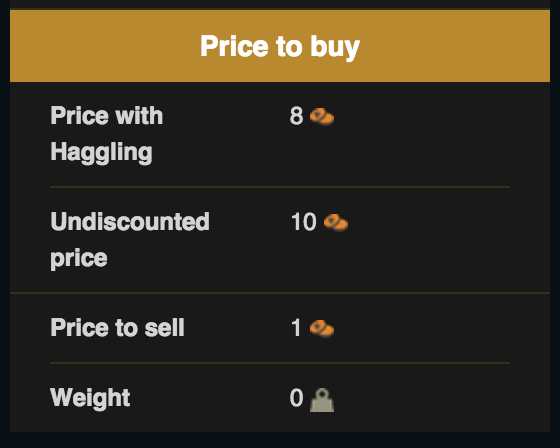
Can be achieved with the following syntax:
  <header>Price to buy</header>
  <data source="buyh">
   <label>Price with Haggling</label>
   <format>{{{buyh}}} {{oren2}}</format>
  </data>
  <data source="buy">
   <label>Undiscounted price</label>
   <format>{{{buy}}} {{oren2}}</format>
  </data>
 <data source="sell">
   <label>Price to sell</label>
   <format>{{{sell}}} {{oren2}}</format>
 </data>
 <data source="weight">
   <label>Weight</label>
   <format>{{{weight}}} {{weight}}</format>
</data>
Available Tags
All infobox fields should be declared using XML convention, with attributes used for field configuration.
| Tag | Attributes | Child tags | Description |
|---|---|---|---|
| infobox |
theme, theme-source, layout |
title, image, header, footer, data, group, comparison | The tag which holds all others and delimits the scope of the infobox |
Usage example:
<infobox>
 <title source="title_source" />
</infobox>
HTML output: <aside class="portable-infobox"> <div class="portable-infobox-item item-type-title portable-infobox-item-margins"> <h2 class="portable-infobox-title">Title</h2> </div> </aside> | |||
| data | source | default, label, format | Standard key value tag |
Usage example:
<data source="name">
 <label>First name</label>
 <default>John</default>
</data>
HTML output: <div class="portable-infobox-item item-type-key-val portable-infobox-item-margins"> <h3 class="portable-infobox-item-label portable-infobox-header-font">First name</h3> <div class="portable-infobox-item-value">John</div> </div> | |||
| label | N/A | N/A | Label tag, can be used only inside other tags, check child tags column for more info. Accepts wikitext. |
Usage example:
<label>First name</label> HTML output: <h3 class="portable-infobox-item-label portable-infobox-header-font">First name</h3> | |||
| default | N/A | N/A | Default tag, can be used only inside other tags, check child tags column for more info. Accepts wikitext. |
Usage example:
<default>John</default> HTML output: <div class="portable-infobox-item-value">John</div> | |||
| format | N/A | N/A | Format tag, can be used only inside other tags, check child tags column for more info. Accepts wikitext. |
Usage example:
 <data source="dollars">
   <label>Regular price</label>
   <format>{{{dollars}}}$</format>
 </data>
HTML output: <div class="portable-infobox-item item-type-key-val portable-infobox-item-margins"> <h3 class="portable-infobox-item-label>Regular price</h3> <div class="portable-infobox-item-value">15$</div> </div> | |||
| title | source | default, format | Should be used only once per infobox, states infobox title. |
Example usage:
<title source="title_source">
 <default>{{PAGENAME}}</default>
</title>
HTML output: <div class="portable-infobox-item item-type-title portable-infobox-item-margins"> <h2 class="portable-infobox-title">Page name</h2> </div> | |||
| image | source | alt, caption, default | Image tag, used to insert image inside infobox. |
Example usage:
<image source="img_name" /> HTML output: <div class="portable-infobox-item item-type-image no-margins"> <figure> <a href="/wiki/File:Image.jpg" class="image image-thumbnail" title=""> <img src="Image.jpg" class="portable-infobox-image" alt="" data-image-key="Image.jpg" data-image-name="Image.jpg"> </a> </figure> </div> | |||
| alt | source | default | Can be used only inside image tag. |
Example usage:
<image source="image">
  <alt source="alternative_title">
  <default>Default alt text</default>
  </alt>
 </image>
HTML output: <div class="portable-infobox-item item-type-image no-margins"> <figure> <a href="/wiki/File:Image.jpg" class="image image-thumbnail" title=""> <img src="Image.jpg" class="portable-infobox-image" alt="Default alt text" data-image-key="Image.jpg" data-image-name="Image.jpg"> </a> </figure> </div> | |||
| caption | source | default, format | Can be used only inside image tag. |
Example usage:
<caption source="caption">
 <default>Default alt text</default>
</caption>
HTML output: <figcaption class="portable-infobox-item-margins portable-infobox-image-caption">Default alt text</figcaption> | |||
| group | layout | data, header, image | Used for grouping fields, can provide header for each group. Group won't be rendered (including header) when all fields are empty. |
Example usage:
<group>
 <header>Group name</header>
 <data source="value1" />
</group>
HTML output: <section class="portable-infobox-item item-type-group"> <div class="portable-infobox-item item-type-header portable-infobox-item-margins portable-infobox-header-background"> <h2 class="portable-infobox-header portable-infobox-header-font">Group name</h2> </div> <div class="portable-infobox-item item-type-key-val portable-infobox-item-margins"> <div class="portable-infobox-item-value">Value</div> </div> </section> | |||
| header | N/A | N/A | Header tag denotes the beginning of a section or group of tags. |
Usage example:
<header>Header Text</header> HTML output: <div class="portable-infobox-item item-type-header portable-infobox-item-margins portable-infobox-header-background"> <h2 class="portable-infobox-header portable-infobox-header-font">Header text</h2> </div> | |||
| footer | N/A | N/A | Used for providing any wikitext. |
Usage example:
<footer>[[Links]]</footer> HTML output: <footer class="portable-infobox-footer portable-infobox-item-margins portable-infobox-header-background portable-infobox-header-font"> <a href="/wiki/Links" title="Links">Links</a> </footer> | |||
| comparison | N/A | set | Used to aggregate fields into set for comparison purposes. |
Usage example:
<comparison>
 <set>
 </set>
</comparison>
HTML output: <div class="portable-infobox-item item-type-comparison"> <table class="portable-infobox-comparison"> <tbody> <tr class="portable-infobox-comparison-set"></tr> </tbody> </table> </div> | |||
| set | N/A | data, footer, header, image | Used to group fields into sets for comparison purposes. Can be used only inside comparison tag. |
Usage example:
<set>
 <header>First set</header>
 <data source="data1" />
 <data source="data2" />
</set>
HTML output: <tr class="portable-infobox-comparison-set"> <th class="portable-infobox-comparison-set-header"> <div class="portable-infobox-item item-type-header portable-infobox-item-margins portable-infobox-header-background"> <h2 class="portable-infobox-header portable-infobox-header-font">First set</h2> </div> </th> <td class="portable-infobox-comparison-item"> <div class="portable-infobox-item item-type-key-val portable-infobox-item-margins"> <div class="portable-infobox-item-value">Data1</div> </div> </td> <td class="portable-infobox-comparison-item"> <div class="portable-infobox-item item-type-key-val portable-infobox-item-margins"> <div class="portable-infobox-item-value">Data2</div> </div> </td> </tr> | |||
Examples
Further help and feedback
- Browse and search other help pages at Help:Contents
- Check Fandom Community Central for sources of further help and support
- Check Contacting Fandom for how to report any errors or unclear steps in this article