
Hi there! As promised in our last blog post, the Mobile Team has a holiday present for you. Close your eyes and...open! It's a new version of our mobile skin! Now go ahead and act surprised like the blog title didn't give it away.
Our mobile skin was long overdue for an update, and this version lays the foundation for more improvements in the future. It's optimized for both iPhone and Android (which covers 95% of our users), and we think you'll like the changes we've made.
Article Layout & Photos[]
The size of phone screens makes it difficult to read multiple column layouts. To combat this, the new mobile skin now has single-column layouts, which solves common problems such as content overlap (which you can see in the "before" photo below). You will notice that the size and spacing of text and buttons have been changed so its easier on both your eyes and your fingers. We've also adjusted the size of the thumbnails and captions for a more enjoyable browsing experience. In addition, if you tap on a photo thumbnail, a larger version of the photo will open in a lightbox, you will then be able to swipe through every single image on the page.
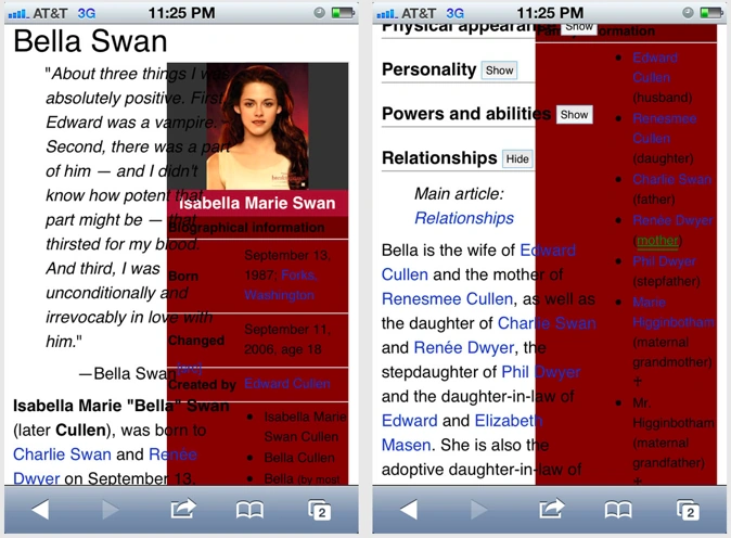
BEFORE: Overlapping columns
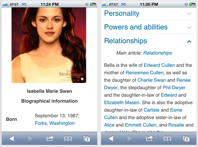
AFTER: clean, single columns
[]
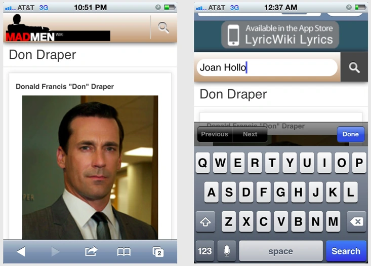
In our last version, we have to admit that it was tough to tell what wiki you were on at first glance. To fix this, we have replaced the old navigation bar with one that features the wiki's wordmark and page color, and contains the search bar.
Additional Changes[]
Here are some further tweaks we made:
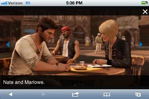
- Slideshows and comments will appear as intended to give a similar look to the browser version.
- Sliders will appear correctly and can adjust according to the orientation of your phone. They will also now display their full descriptions.
- Large tables will be rendered at full scale in articles and will be visually cropped when necessary, so they don't affect the layout of the articles. To see the full table, simply tap it and a lightbox will appear, allowing you to swipe around and access every single pixel.
Moving Forward[]


Though we are very excited about this mobile skin release, we are even more excited about the changes to come. We want to emphasize that this is just the foundation. We plan on releasing more fixes for layout bugs, adding access to your local wiki nav, integrating sharing tools, and giving you the ability to make lightweight contributions.
Since we're always interested in what you have to say, we've added a little feedback form at the footer of the new mobile skin. When you give us your feedback, please be specific about the phone you're using, the wiki and page you are seeing, and what you think of the experience. You can also leave comments on this blog post. We'd love to see you share tips with one another on how to optimize for this new browsing experience. As you edit your wikis, start asking yourselves: How will my content display on a phone? How will mobile visitors use my wiki? We're heading into a world in which more people will own mobile devices than personal computers, and we want to help you be ready for it.
Happy Holidays from the Mobile Team!